Creative & Branding · We Get Stuff Done
See the difference good creative makes,
side by side.
Before and after, in the work itself. A logo, a fleet, a circular. We refresh what is tired without losing what your customers know, and we design it in the same building that prints and installs it.
- You see the proof, not a pitch. Real before-and-after pairs, side by side, so you can judge the work by what it does.
- We refresh you, we do not replace you. The old look still feels like you. The new one just works harder. We keep what is working and fix what is not.
- We design it to get made. Every new piece is drawn for the press, the material, and the sign it ends up on, and the same team here prints and installs it. That means faster turnaround, one point of contact, and nothing lost between vendors.
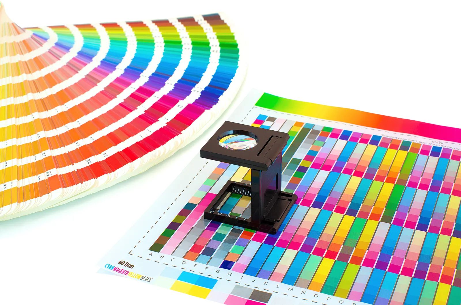
What you are looking at
A before, an after, and the reason it works harder.
Real work, shown the only fair way to judge creative: side by side, before and after. Not so the new one looks pretty in a frame, but so you can see it do its job better than the old one did.
The work, side by side
Three before-and-afters, and what changed in each.
Each one started with a real goal, not a need for something new. Here is what the old look was up against, and what the new one fixed.
Before & after, coming soon Boyer's old brand mark beside the brand we run today.
Boyer's: a brand built to grow
The goal was a regional grocery brand that could carry a weekly circular, in-store signage, and a recipe site without falling apart across channels. The after is one consistent look the whole program runs on.
Before & after, coming soon A Karns truck before the new look beside one wearing it.
Karns: reads at 60 miles an hour
The goal was a fleet that works as a moving billboard, legible from across a parking lot or a passing lane. The after holds up on the side of the truck, not just on a screen.
Before & after, coming soon A cluttered circular beside the redesign a shopper reads in five seconds.
Circular: shop it in five seconds
The goal was a weekly ad a customer can scan and shop fast, instead of a wall of clutter. The after went from a page people skipped to a page that moves the item.
“From the very beginning, we found Weber Advertising to be great at follow-through and in just flat out getting what we needed done. They were instrumental in developing our brand, and since we started working with them, we have averaged growth that has outpaced the industry average by 300% over the last five years.”
More before-and-afters land here as clients clear them. Want to see one in your industry? We will walk you through it.
The "after," out in the world
A good "after" does not live in a frame. It lives on the shelf.
A design only counts once it is made and out where your customer stands. Here are three finished pieces we drew, printed, and put in the field: on a shelf, on a building, on a sidewalk, for clients who have trusted us with their name for years.
- 60 mpha logo built to read from a passing lane
- 5 seca circular a shopper reads, not skips
- 1 buildingdesign, print, and install, zero handoffs
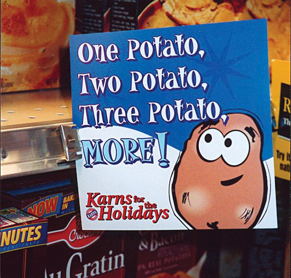
On the shelf, at Karns
A shelf talker has one second to catch a shopper mid-aisle. This one earns the look and points at the buy, then prints in-house and ships to every store on time.
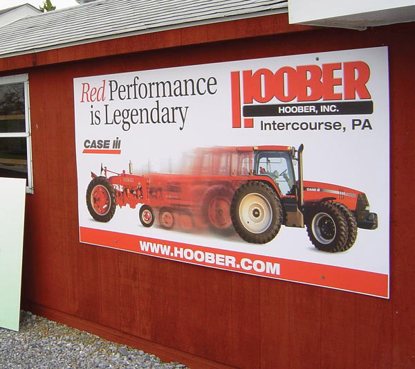
On the building, at Hoober
Big format, read from the road, mounted straight on the wall. We drew it knowing the size of the panel and how it hangs, because the same shop that designs it makes it.
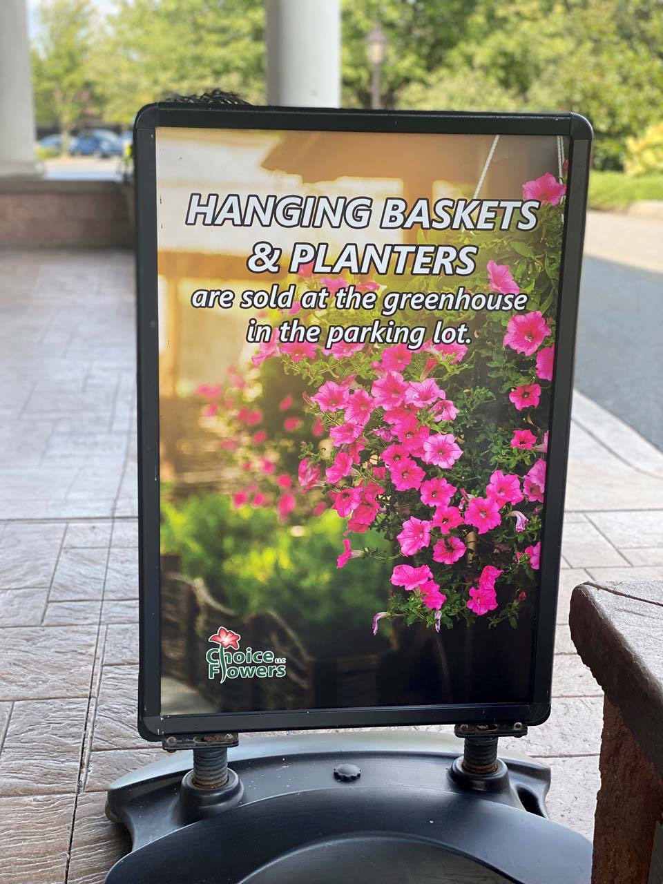
On the sidewalk, out front
A sidewalk sign has to stop a walk-by and say one clear thing. This one does its job in a glance, weatherproof, ready to set out front every morning.
Every one started as a sketch in this building and ended as a printed piece doing a job. The matched before-and-after pairs go in the gallery above as each client clears the "before."
Before we touch a thing
We are here to help build your vision, not to change it.
Here is the part that keeps clients comfortable. If you love your current look and it is just tired, we refresh it. We do not talk you into a brand you do not recognize so we have something new to show off.
We keep what is working, the thing your customers already recognize, and we fix what is fighting you: the logo that smears at small sizes, the colors that drift from one vendor to the next, the layout that buries the offer. You will still be you. You will just be sharper.
The before still has to feel like you. The after just has to work harder.
That is the whole point of our creative: to help you make money.